Wednesday, December 3, 2014

The NYC neighborhood posters were created for See Your City, a NYC & Company campaign


I really liked See Your City Travel poster campaign. It remind me of the  Michael Schwab travel poster we have done in Illustration 273. I really enjoyed that project it has that 1930s - 1940s classic look to the travel posters.
These are nice inspiring collector pieces for different parts of the States. I enjoy the color scheme as well as the simple illustration that describes the place of the state.

Source See Your City Travel

Communication Arts 

Wednesday, November 19, 2014

How Branding Launched Michael Jackson


I was reading on article about Michael Jackson's solo career and how he branded himself on Print magazine. But beside that I choose this pieces because of its illustration and watercolor. I really have the desire learning how to work color and adding it to some of my design pieces. This Michael illustration is nice because complements well with light hint of color in the background. Dont Stop Till You Get Enough was the  first big hit form Off the Wall when the album that distinguished Michael from the rest of his family of 5. I think this piece distinguishes him because your eye leads straight to Michael first.

Source Michael Branding article

Print Magazine

Wednesday, November 12, 2014

Jolly Time | Museum


Source Communication Arts

I came across this nice website for Jolly Time popcorn/ museum. I really enjoyed looking at the structure and history in making of Jolly Time popcorn and the brand itself.  The Brand really explains for itself ( It has the feeling of enjoying popcorn when watching a movie or some sort of gathering etc...) I like the movement of icons almost like popcorn popping. The design layout is fun, inviting, and fits in today's style or genre.

Source Jolly Time | Museum 

Wednesday, November 5, 2014

Art of Whimsical Lettering


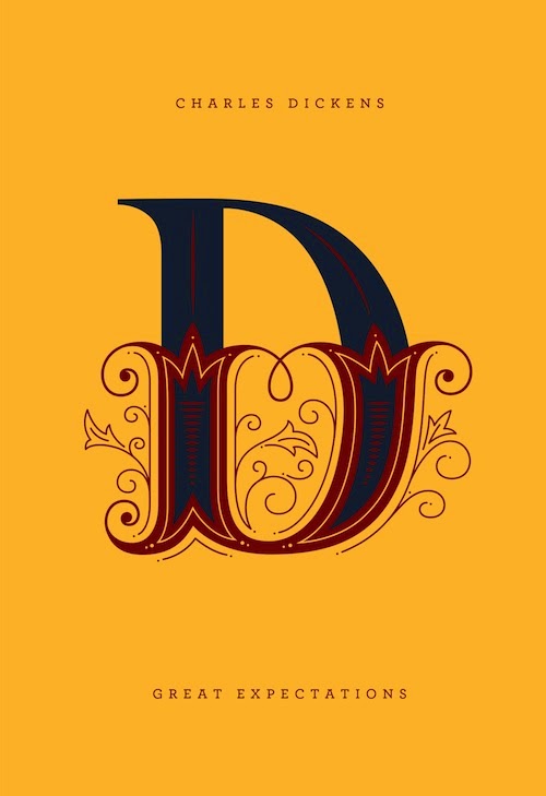
 I am came across this book article from Print magazine, This is a useful book of tools and techniques discovering your handwriting and different techniques using all sorts of pens, inks, brushes, markers, paints and pencils.  It would help those who are seeking to become a typographic artist and would like to sell their font professionally. This kit comes with a perfect pen hand lettering kit that many graphic designers might want to invest in. I really like the cover of the book which makes it stand out because of its hand generated font that is one of a kind. It distinct from other books that usually made computer generated. 

Wednesday, October 29, 2014

Simpons Marathon Advertising

This is by far on of my favorite Simpsons advertisement. It is so brilliant how the designers calibrate all the charters into one interesting collage. The design pieces explains it self from the typographic choose relating to the Simpsons, each charters is spot out color choice describing the Simpsons family structure. Overall a well design advertisement. I wish I could of thought of this but I need some time creating something like this concept.

Source Simpsons Marathan

Wednesday, October 22, 2014

OXLOT9

So my goal for the years to come as a graphic designer is to recreate my logo design. I came across this logo design for a southern seafood restaurant in Covington Louisiana. The logo design is a fish and nine. It is really nice because the hand drawn style shows the classic nature of the restaurant  and the history it has. This logo is simple yet elegant which the restaurant portrays.

Source http://www.ideogramstudio.com/

-How Magazine

Wednesday, October 15, 2014

Best Book Covers: Penguin Drop Caps


Print Magazine : Best Book Covers Penguin Drop Caps

Elda Rotor, the editorial director of Penguin Classics, saw Daily Drop Cap and began thinking about creating a line of hardcover editions alphabetized by the authors’ names. Rotor spoke with art director Paul Buckley about designing an “A” to “Z” series of Penguin Classics, and she and Buckley eventually came up with the vision for an entire rainbow spectrum of 26 books.

LINK TO SOURCE